
21 Wedding Welcome Sign Wording Examples For Every Style
Wedding Welcome Sign Wording: Examples for Every Style
Wedding welcome sign wording works best when guests can read it in a few seconds. The design can be elaborate, but the actual message should stay simple.
Wedding signs are part decoration and part wayfinding. When they are planned well, guests notice the information without having to stop and study the sign, and the visual style quietly supports the rest of the event design.
This guide focuses on wedding welcome sign wording from a practical planning perspective. The goal is not to follow a rule for its own sake, but to choose an approach that fits your guest count, wedding style, and the way you hope to remember the day afterward.
Classic and formal wording
“Welcome to the wedding of [Name] & [Name]” followed by the date is clear and timeless.
Consistency also helps. Repeating one or two decisions—such as typography, personalization style, or a simple color family—creates cohesion without requiring every wedding piece to match exactly.
Warm and modern wording
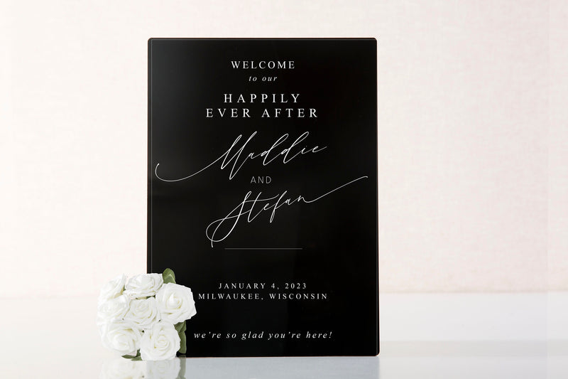
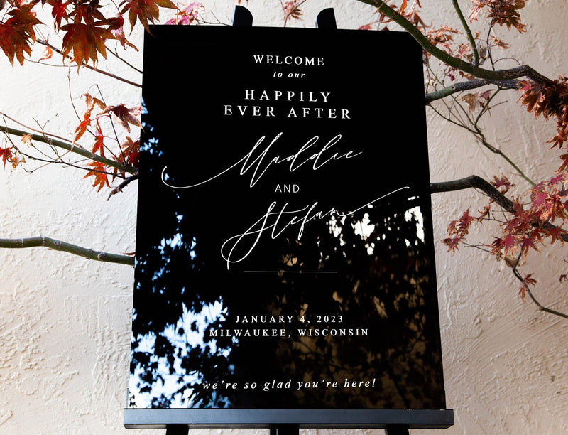
“We’re so glad you’re here” or “Welcome to our forever” can create a relaxed tone while keeping the couple’s names prominent.
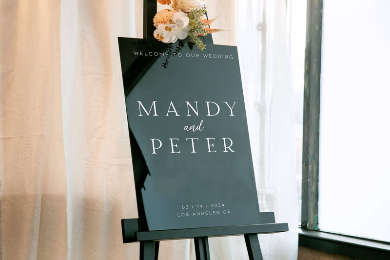
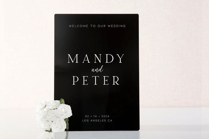
For real-world wording inspiration, compare this personalized acrylic wedding welcome sign and modern acrylic wedding welcome sign
Think through this choice from the user’s point of view. What feels obvious while you are planning may be less obvious to a guest encountering it for the first time in a busy room. Clear visual cues and a straightforward setup usually matter more than adding another decorative detail.
Minimal wording
Names, date, and “Welcome” are enough for a modern sign where typography and material do most of the visual work.
Build in a little extra capacity. Weddings rarely unfold with perfect efficiency, so spare space, backup supplies, and a flexible layout can prevent a small planning assumption from becoming an event-day problem.
Destination wedding wording
Include the location or a line such as “Welcome to [City]” when travel is part of the celebration story.
Before committing, make a quick mock-up with the real dimensions or supplies. A five-minute test can reveal whether there is enough writing room, whether the wording is readable, or whether the item will feel awkward once other wedding details are placed around it.
How to coordinate the sign with other pieces
Repeat one visual element—font, color, monogram, or material—across the welcome sign, seating display, bar signs, and table signs so the reception feels cohesive.
Try not to solve a functional problem with decoration. First make the item easy to use and understand; then add the styling choices that make it feel personal to the couple.
Design for distance
Wedding signage is functional first. Check the size and contrast from the distance at which guests will actually read it, not only from arm’s length during setup.
Keep the decision simple by identifying the one outcome that matters most, then remove anything that does not support it. Wedding details are easier to execute when each item has a clear job.
Build a small visual system
Use a consistent font family, color palette, corner radius, stand style, or motif across signs. Repetition makes mixed sizes and materials feel intentional.
Keep the decision simple by identifying the one outcome that matters most, then remove anything that does not support it. Wedding details are easier to execute when each item has a clear job.
A practical checklist before you decide
- Confirm exact wording before production.
- Measure the placement area and viewing distance.
- Check text/background contrast.
- Choose stands or mounting hardware that fit the venue.
- Create a packing plan to prevent scratches or edge damage.
Common mistakes to avoid
Avoid low contrast, excessive wording, tiny type, and signs that duplicate information guests already have. Also confirm how each sign will stand or hang; a beautiful sign without the right support can become a setup problem.
Frequently asked questions
What should a wedding welcome sign say?
At minimum, include a welcome message and the couple’s names. The date and location are optional.
Does a welcome sign need the wedding date?
No. It is useful for photos and keepsake value, but the sign can be cleaner without it.
Where should the welcome sign go?
Place it near the ceremony or reception entrance where guests naturally approach and have enough distance to read it.
Make it part of the story, not just another wedding detail
MUUJEE Signs creates personalized wedding and event signs in styles suited to welcome displays, guestbook stations, tables, and reception details. Choose wording and materials based on readability first, then coordinate the design with the rest of the event.
Explore personalized wedding and event signage at MUUJEE Signs.
How to make the final choice with confidence
When two options both seem reasonable, choose the one that reduces friction on the wedding day and still feels useful afterward. Weddings contain many small decisions, so the most durable choice is often the one that is easy to explain, easy to use, and easy to store. Imagine the item at three moments: during setup, while guests or the couple are actively using it, and one year after the wedding. If it works in all three situations, it is probably a strong choice.
It also helps to separate “must have” features from “nice to have” features. Must-have features affect function: enough writing space, readable wording, accurate personalization, appropriate size, or practical storage. Nice-to-have features affect styling: a particular ribbon, decorative phrase, or accent. Make the functional decision first, then use design details to make the piece feel personal.
Finally, leave a little margin for real life. Guests write larger than expected, timelines run late, tables get moved, and keepsakes accumulate. Extra space, simple instructions, and a flexible format are rarely wasted.